Apple Ate My App Icon
I built a small booking app for my site called Book a Time. It runs in the browser, and on an iPhone you can add it to your home screen so it opens like a real app. I made it a nice little icon: a black book on my site yellow. It took five minutes.

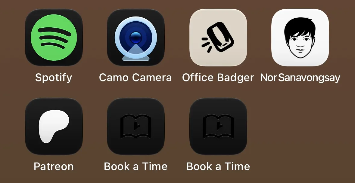
Then I switched my home screen to dark mode, and my icon turned into a black square.
It was a black square with a faint black book embossed on it, like a tombstone. Right next to it, my Office Badger icon (black badge on beige) and my site icon (my face on white) looked exactly the way I made them.
So I did what any reasonable designer would do. I spent the rest of the night arguing with a phone.
Everything I tried
I started with the obvious guesses and worked my way down to the desperate ones:
- A softer yellow, in case iOS hated the bright one. Black square.
- Plain white, same as my site icon, which works. Black square.
- White pages filled in inside the book. Black square.
- Solid black book with a yellow clock hand. Black square with a floating yellow clock hand, which was somehow worse.
- A yellow gradient. Black square.
- The exact beige from the badger icon, the one that works. Black square.
- The book tilted 10 degrees, because the badger is tilted. Black square.
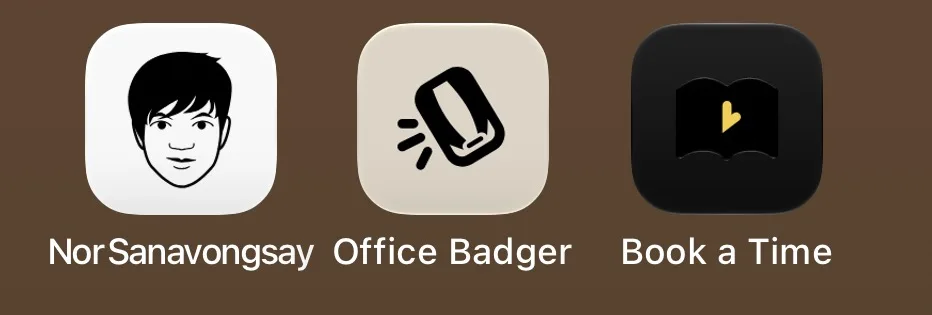
The only book that survived was a light yellow gradient with white pages, and when I tried the same thing in light gray, it went black again. At that point I had stopped designing and started bargaining.
The clue
The giveaway was a shadow. Even in light mode, iOS added a soft drop shadow under my book. I never drew a shadow. The badger and my face didn’t get one.

That’s the tell that iOS has decided your icon is a symbol sitting on a background. It cuts the symbol out, throws your background away, and redraws it with its own dark tile. That works great if your symbol is white. If your symbol is black, it disappears into the black tile it was just placed on.
So the question was never about colour. It was about which icons iOS decides to cut apart.
The test that cracked it
I kept everything the same, the flat yellow, the size, the file, and swapped only the drawing. I used the coffee cup icon from my support page.
The cup stayed yellow in dark mode. The book went black. Same background, same everything.

So it was the book. My open-book drawing apparently looks enough like a standard system symbol that iOS felt entitled to restyle it. I can’t prove that’s the reason, because Apple doesn’t document any of this, but it’s the only thing that fit.
I redrew the book from the side, a cover with the clock hand and a spine, and it worked on the first try.

What I’d tell you before you lose a night to this
If you’re making a home screen icon for a web app (an apple-touch-icon):
- Use a 180×180 PNG with a solid background. That part is well documented, and it was never the problem.
- There’s no way to give a web app its own dark mode icon, so iOS will make one for you whether you like it or not.
- Avoid generic glyphs, especially ones that look like Apple’s own symbols. A centered book, a plain outline, a familiar shape: those are the ones that get cut out.
- Distinctive art survives. Something tilted, detailed, or drawn in your own style reads as a picture, and iOS leaves pictures alone.
- Test on a real phone in dark mode before you call it done. Delete the icon and add it again every time you change it, because iOS saves the icon when you add it.
My booking app finally has an icon that stays yellow. It took eighteen versions, one coffee cup, and more swearing than I’m proud of.