This site runs on MakPow, a small design system I built and named after the Lao word for coconut, one of the most versatile fruits in the world. It has tokens in CSS, components that use only those tokens, and a theme layer for my apps. Everything on this page is read from the same files the site ships, so it can’t drift from the code. The tokens are also published as JSON for tools and AI agents.
The site follows your device: light or dark. Semantic tokens are what components use; the dark values live in .theme-auto inside a prefers-color-scheme: dark query, and admin stays light. Contrast is measured against the page background, or, for fills, with ink text on top. Text on yellow is always dark (--text-on-yellow).
Bigshot One. Page titles and section headings (h1, h2). One weight, so it never fakes bold.
Office Badger
--font-heading
Inter. Smaller headings, tile titles, labels.
I design systems that live in code.
--font-sans
Inter. Body text, nav, buttons, forms.
Every artist was first an amateur.
--font-quote
Trocchi. Blockquotes. Regular only, so quotes stay upright instead of a faked italic.
Heading scale
Headings step down by the golden ratio (--type-ratio: 1.618): h2 is h1 divided by 1.618, and h3 is h2 divided by 1.618. Sizes stay fluid because each level is calculated from the one above. h4 matches body text and h5 matches subtext. Every page title uses --h1-size, blog posts included.
--h1-size · Page titleBook a time
--h2-size · Section titleBook a time
--h3-size · Sub-sectionBook a time
--h4-size · Same size as bodyBook a time
--h5-size · Subtext sizeBook a time
Lead-in
The opening paragraph of case studies and captions: a bright first sentence, then muted text. --lead-size grows smoothly from about 19px on phones to 24px on desktop, with no jump at a breakpoint.
Designer, illustrator, and storyteller. I make design systems, apps, comics, and picture books.
Text scale
--text-xs · 12pxBook a time
--text-sm · 14pxBook a time
--text-base · 16pxBook a time
--text-lg · 18pxBook a time
--text-xl · 20pxBook a time
--text-2xl · 24pxBook a time
--text-3xl · 30pxBook a time
--text-4xl · 36pxBook a time
--text-5xl · 48pxBook a time
Space & shape
Spacing
--space-1 · 4px
--space-2 · 8px
--space-3 · 12px
--space-4 · 16px
--space-6 · 24px
--space-8 · 32px
--space-12 · 48px
--space-16 · 64px
Radius
Three roles. Controls are tight, surfaces are soft, pills are round. Components use these, not the raw scale. App icons use the iOS corner, a share of the icon's size.
--radius-control · 8px
--radius-surface · 24px
--radius-full · 9999px
--radius-app-icon · 22.37%
Elevation
--shadow-sm
--shadow-md
--shadow-lg
Buttons
One component. Variants set color; sizes only swap component tokens (--btn-py, --btn-px, --btn-font-size, --btn-radius), which map to the base scale.
Buttons inside article text keep the button look. They never pick up the yellow link underline, so Previous / Back / Next at the end of a post or comic use btn btn--soft btn--sm.
Forms
Controls inherit the page font. Selection uses the site yellow with dark marks, so the state stays visible in both themes.
Links
Inline links get a yellow underline in the primary button color (--link-color). On hover the underline turns ink (--link-hover-color) and the text keeps its color. Calls to action use Read more.
Content
Blog posts and case studies are written in Markdown and rendered by the site. These are the article styles they pick up.
Every post opens with a drop cap in the display font. It uses initial-letter, so its top lines up with the capitals of the first line and its base sits on the third; browsers without it get a floated letter. Inline code sits on a soft yellow chip in ink, which passes contrast where yellow text did not.
Every artist was first an amateur.
> Every artist was first an amateur. -- Ralph Waldo Emerson

<blockquote><p>Every artist was first an amateur.</p><footer>Ralph Waldo Emerson</footer></blockquote>
A quote that ends with “— Name” or “-- Name” gets the name moved into a small footer, so posts don't need any markup for it.
Case study panels
Images sit on pastel panels that fade from the top down. The hue cycles down the page (sky, mint, lemon, peach, rose, lilac) from the prism tile tokens, set once with --panel-bg. A titled section opens with project-section-title and a larger intro.
Whiteboard sketch
Final product
In use
<section class="project-group">
  <p class="project-group-label">Final product</p>
  <div class="project-group-image"><img src="..." alt="..."></div>
  <p class="project-group-caption"><strong>Lead.</strong> The rest of the caption.</p>
</section>

.prose section.project-group:nth-of-type(6n+1) { --panel-bg: var(--tile-prism-sky); }
Tiles
Home tiles follow Apple's card pattern: the whole tile is the link, and a soft button is only the cue. Each variant is one class that sets --tile-bg from tile tokens. Most fade from the top down; prism is a light rainbow at an angle, and ink is the one dark tile.
The "More work" thumbnails at the end of each case study. Images stay clean; the title sits on a soft bluish fade in ink, pebble and mist alternating. Empty images show an image icon and keep their title; work under NDA shows a lock, set by one class.
App cards light up on hover with a gradient that travels around the edge (--ai-gradient), a nod to the apps being built with AI. It's a large disc spinning behind the card, with the card fill covering its middle, so it works in every browser. Icons use the iOS corner.
Home screen icons are 180px PNGs. iOS restyles simple, symbol-like icons on its dark home screen, so app icons use distinctive art rather than a generic glyph.
Comics
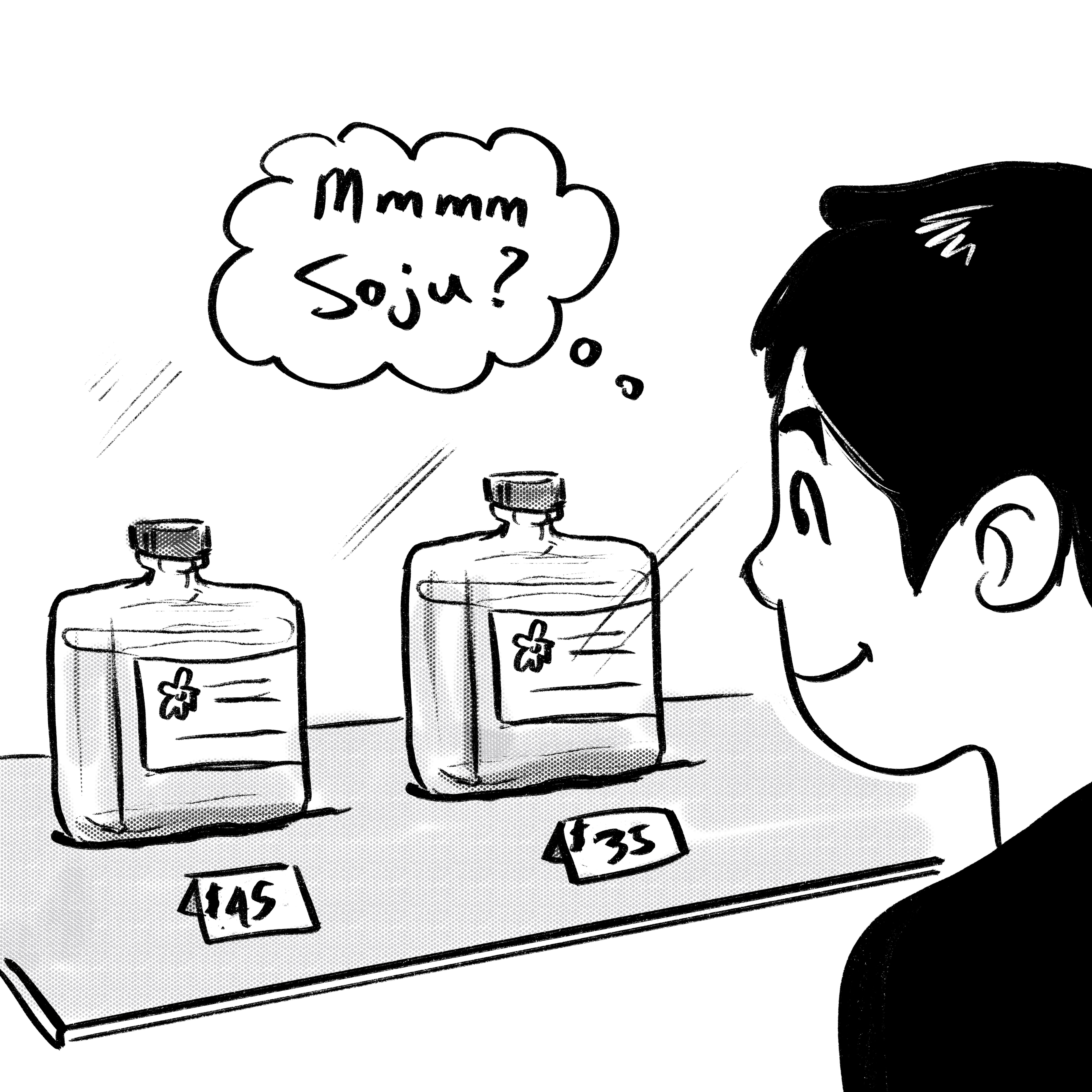
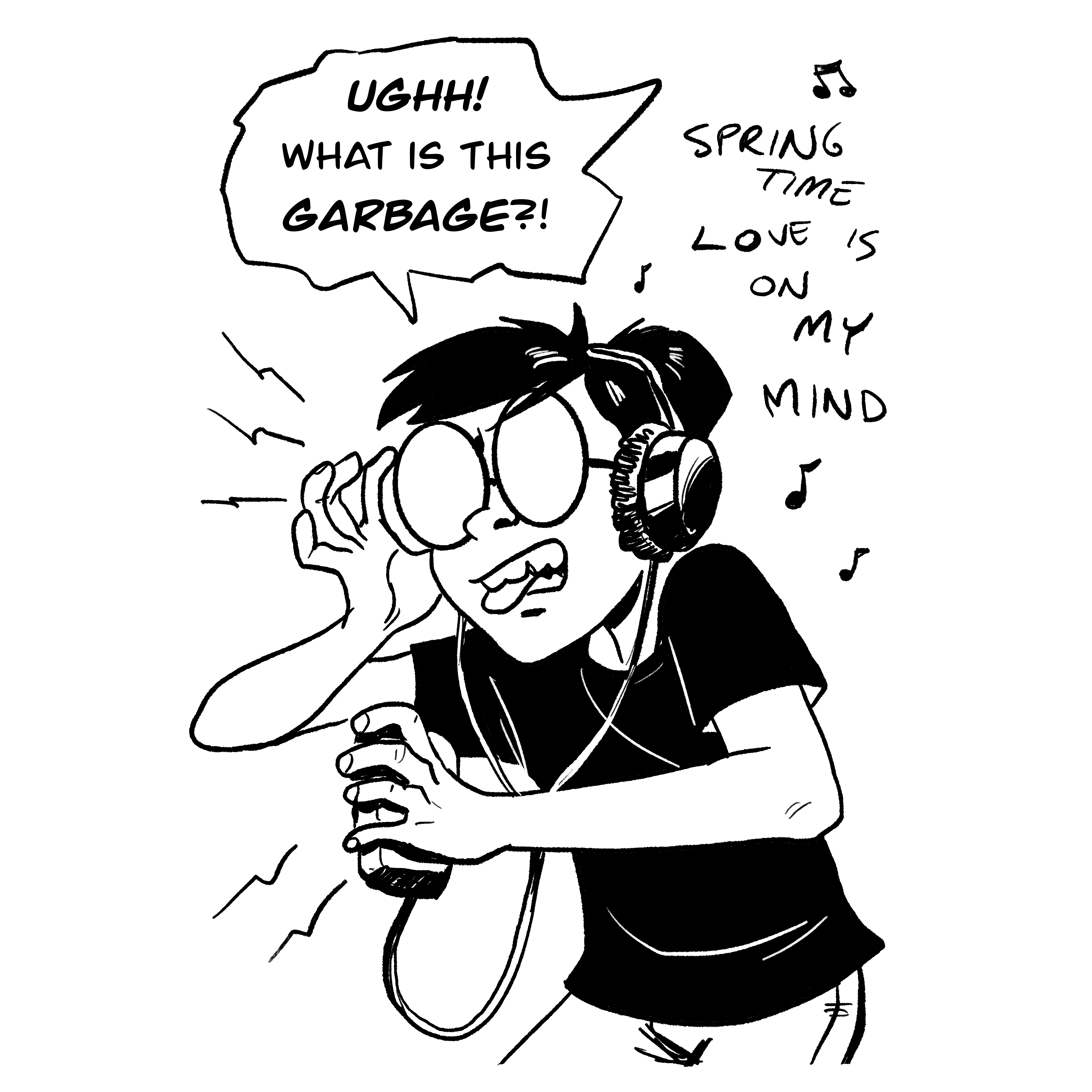
The comics pages carry their own style, ink panels and halftone, built only from site tokens. Each comic is a panel with a 2px ink border and a yellow caption box with a hard shadow. On hover the caption lifts and a halftone halo spreads out behind the panel, with dots that shrink toward the edge. The halo is one SVG used as a mask, so its color comes from a token.
My apps keep their own personality without forking components. Office Badger points the shared tokens at its own colors, and the same button classes pick them up.